
Making a good pre-launch landing page is both an art and a science.
Yes, it has to look great. But it also has to make someone want to give you their email address. And doing both of those things well is easier than it sounds.
Here at LaunchBoom, we’ve built literally thousands of pre-launch landing pages over the last decade, so I have some pretty strong opinions about what works and what doesn’t. And in this post, I’ll be sharing 8 of the best examples that you can apply to your upcoming launch.
Also, if video is more your thing, check out this YouTube video I made on the subject:
Key Takeaways
- The pre-launch phase is the most important: having the right Kickstarter marketing strategy for the pre-launch is vital for Kickstarter success.
- Landing pages are where you collect emails (and nothing else!): keep your pre-launch landing page focused on one call-to-action and avoid adding links for visitors to navigate away.
- Copywriting is the most important: If you have bad copy on your landing page, the design won’t matter.
- Model what works: examine pre-launch landing pages from successful crowdfunding projects and model your landing page off of them.
Contents
What is a pre-launch landing page?
Before we get into the examples, let me give a quick primer.
A pre-launch landing page is a website that you will use to promote your upcoming launch. This isn’t a full website with a menu to navigate to other pages. It’s a single page with a single goal: get people to give you their email address to be notified about your launch.
It’s important to note that your pre-launch landing page is one page in a series of pages that the marketing world likes to call a funnel.
At LaunchBoom our favorite type of funnel is the reservation funnel. With a reservation funnel, the goal is not only to collect email addresses, but $1 deposits from people for them to reserve your best launch deal. We found that those who put down the deposit in the pre-launch are way more likely to follow through with their purchase, which is why getting the reservations can be so valuable.
For example, one of our clients, Loka Chai Maker, used the reservation funnel for their launch and went on to raise $664,214. Here was their pre-launch landing page:
This was just the first page in a series of pages in their reservation funnel. The entire funnel looked like this:
Now that you have a good primer on what a pre-launch landing page is, let’s talk about how to make one that converts.
3 Tips to Build a High-Converting Pre-launch Landing Page
There are many best practices for designing a landing page, but I’m going to focus on the three must-haves. Even if this is your first landing page ever, these tips will help you create one that’s fine-tuned for crowdfunding.
Tip #1: Copywriting is more important than design
Beautiful design won’t save bad copy.
That’s why you must get the words right before moving on to making your landing page pretty. This is easier said than done, but it’s not too difficult.
If you’re not a great copywriter (which I’m assuming most of you reading this are not), then here’s what I would recommend.
- Find a landing page of a successful company that (1) is targeting a similar market to you and (2) has copywriting that matches the style you’re going for.
- Copy and paste the copy from that page into a Google Doc.
- Open your favorite LLM like ChatGPT or Claude (my preference for copywriting).
- Upload the Google Doc with the example and use this prompt:
I’ve uploaded copy from a website that I like. I want you to create an incredibly detailed style guide that outlines the tone, voice, and writing style of the copy. This style guide should be exactly what an LLM would need to perfectly replicate the style of writing in the example. Again, be very detailed. Take your time and don’t mess up.
The LLM should give you a very detailed style guide. Read through it and make sure there’s no glaring mistakes. In my experience, it’s pretty good on the first shot.
Next, you’ll want to create an outline of your landing page copy. A bulleted list will work just fine. Write down the main points you are trying to get across in each section of your landing page. Once that’s done you can upload your landing page outline along with the style guide that the LLM created and ask it to write your landing page copy.
I’ll tell you right now, it won’t be perfect. But it’ll probably be better than most humans’ first try. Take whatever the LLM gives you and refine it.
Tip #2: Have one call-to-action (CTA)
This one’s straightforward: do not add more than one CTA on your landing page.
It should be obvious what you want people to do. If you add any exit paths or additional CTAs, then people will get confused and not take the action that’s most important at this stage in the funnel.
All you want people to do on your landing page is get interested in your product and give you their email address.

Tip #3: Use high quality imagery
If your page doesn’t look great, someone will bounce sooner than you can blink… literally.
Research shows that people judge websites in as little as 50 milliseconds. That’s why it’s so important to invest in great imagery. And when I say “imagery,” I’m talking about great photos or photorealistic renderings of your product.
Great imagery complements great copywriting. It showcases every feature, benefit and use case and makes each one crystal clear in the eyes of the visitor to your page.
High quality imagery doesn’t mean high cost. There are ways to go DIY or hire a freelancer that can still produce great imagery. I go over those options and how much a Kickstarter costs in this article.
Also, if you want to go deeper into this subject, I learn the exact images you should get, watch this video:
8 best pre-launch landing page examples to inspire your crowdfunding campaign
Alright, it’s the moment you’ve been waiting for. Let’s get into eight of my favorite Indiegogo and Kickstarter pre-launch landing pages. Hopefully, you’ll be able to draw inspiration for your own design.
1. Polycade Sente
 (click the image to see the full page)
We’ll start by looking at Polycade Sente, a Kickstarter campaign that we helped raise $1,658,958 (with $1,050,872 of that coming in the first 24 hours). Polycade Sente went with a minimalist design aesthetic to complement the clean, minimalist look of the product.
You can also see an archived version of the landing page here.
2. SeatMate
(click the image to see the full page)
Next we have SeatMate – a pet office furniture product that we helped raise $488,623 on Kickstarter. Like the Polycade Sente, this page also kept with a fairly minimalist aesthetic. One of the parts I love about this page is how much they leaned into social proof. For example, having the “Veterinarian approved” section added a lot of credibility.
You can also see an archived version of the landing page here.
3. Nitropress
(click the image to see the full page)
I love nitro cold brew as much as I love this page. This is the landing page of Nitropress who we helped raise £649,688 on Kickstarter. The product itself is beautiful, which is why they let the product imagery really shine through in the design.
You can also see an archived version of the landing page here.
4. Fuse Audio GLD
(click the image to see the full page)
Fuse Audio GLD is a vertical record player that we helped raise $631,249 on Kickstarter. It’s not that difficult of a product to understand, so the page is fairly short and focused on showcasing beautiful imagery of the product.
You can also see an archived version of the landing page here.
5. Ring One
(click the image to see the full page)
Ring One, a smart wearable device that we helped raise $1,675,146 on Indiegogo. Besides the bold, high tech aesthetic, I love their use of super high quality photorealistic renders. They show that you don’t have to have real photos to make a great landing page.
You can also see an archived version of the landing page here.
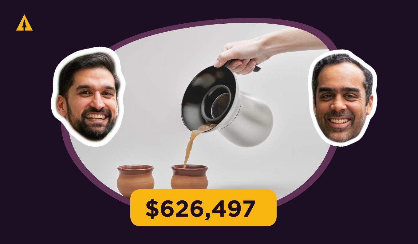
6. Loka Chai Maker
(click the image to see the full page)
You got a teaser of Loka Chai Maker’s landing page above. Now you can see the whole thing. The whole page is great, but I especially love their use of subtle design elements that really make the page have its own unique character.
You can also see an archived version of the landing page here.
7. Inku Calendar
(click the image to see the full page)
I love Inku Calendar. It looks simple, but the tech is actually fairly complex. We helped them launch on Kickstarter and raise $284,684. This page did a great job of explaining the benefit of the product while also showcasing their fun, lighthearted brand.
You can also see an archived version of the landing page here.
8. Xnote
(click the image to see the full page)
Lastly, we have Xnote, a revolutionary smart pen that turns written notes into a digital, AI-generated copy. We were able to help them raise $259,394 on Kickstarter.
Launching hardware that makes bold claims can sometimes be a tough sell for potential backers, so having more than just static images can go a long way in generating conversions. Check out how they included lots of animated gifs on their landing page.
You can also see an archived version of the landing page here.
Use these examples and make your own
When it comes to making your own landing page, remember, you don’t have to reinvent the wheel. Use the examples from this article and model them for your own landing page. Or if you want some more support, we’re here to help.
Just reach out to us by clicking on this link and we can jump on a call. We can not only help you build your landing page using our software, LaunchKit, but can help you hit your funding goal on the first day.
Best pre-launch landing page examples: Frequently asked questions
Why Is a pre-launch landing page important for a crowdfunding campaign?
The pre-launch phase is the most important part of your crowdfunding journey. Your pre-launch landing page is where you’ll collect email addresses from potential backers who are genuinely excited about your product. By investing time and money in building a solid pre-launch page, you can greatly increase your chances of hitting your funding goal quickly.
Can I use templates for my pre-launch landing page?
Yes, you can use templates for your pre-launch landing page, but remember this: a template is just a starting point. The most important aspect of your landing page isn’t actually the design – it’s the copy. Beautiful design won’t save bad copy. If you’re not a great copywriter, find a landing page from a successful company targeting a similar market with copywriting you like and use an LLM like Claude to analyze the style. Use a template for structure, but customize it with your brand voice, high-quality imagery, and a single, clear call-to-action.
How early should I set up my pre-launch landing page before the crowdfunding campaign?
You should have your pre-launch landing page up and running at least 2 months before your campaign launches. During these months, you should be running ads to your landing page, testing different messaging, building social proof, and gathering feedback on your product. Creating your pre-launch landing page isn’t a task you check off and forget – it’s an evolving tool that you’ll continue to refine.
Should my pre-launch landing page include a video?
Your pre-launch landing page can include a video, but it’s not necessary. If you do end up using a video, make sure it’s short, has no sound and autoplays when someone reaches the page. Remember, most visitors to your landing page will be on mobile devices and won’t spend time watching an entire video.
Can social media be integrated with pre-launch landing pages?
You should only integrate social media into your landing page if it will add credibility to your page. For example, if you have 50 thousand followers on Instagram, you could highlight that so visitors know people already like your brand. What you should not do is include links to your social media pages. Remember, the goal is to gather email addresses, not social media followers.