Landing pages are an essential piece of the pre-campaign puzzle. Every time we test a product’s viability in the crowdfunding market, we use them to educate and nurture leads. For those who want to build the funnel themselves, it can be tough knowing how to start the landing page design process.
There’s a lot to consider when building a landing page, from colors to page alignment. We’ve designed thousands of these pages over the years. Over that time, we’ve learned how to give ourselves the best chance of making products resonate. Here are 5 simple tips on how to design a landing page for crowdfunding that converts.
Contents
Tip #1: Determine your goal
Every landing page should have a goal. Without one, you’ll be completely aimless. To understand your goal, you can start by asking yourself a few basic questions like:
- What do I want this landing page to accomplish?
- Who do I want to attract?
- What do I want them to think?
- How do I want them to feel?
The answers to these questions will serve as the foundation that will guide every decision you make when designing your landing page.
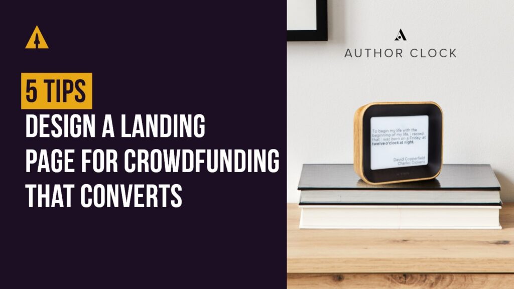
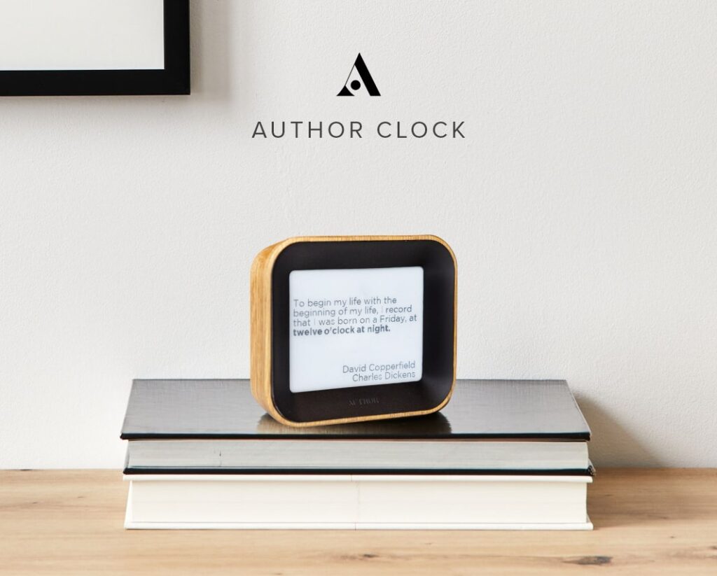
For example, let’s break down how we determined our goal for Author Clock, a campaign that went on to raise $1.3 million dollars on Kickstarter.
What did we want to accomplish?
Author Clock is a clock that tells time using literary quotes, which is a completely unique product. We knew we wanted to make viewers of the page excited and intrigued.
Who did we want to attract?
The target audience for us was people with an interest in reading and literature, but that can be limiting. We decided to open it up to a broader technology and hobbyist audience. One way this informed our design was we had to make sure to use quotes that were written by recognizable names like William Shakespeare and Arthur Conan Doyle.
What did we want them to think?
We wanted them to think they were seeing something extremely creative and “novel!” We needed to accentuate the product’s unique selling propositions (USPs) through our imagery and copy.
How did we want them to feel?
We wanted the creative nature of the product to inspire the audience to let their own creativity out. We placed major design emphasis on the feature that lets backers add their own quotes that aren’t already in the clock’s database.
Tip #2: Develop a strategy
By now you’re probably asking yourself “where is the part where we talk about fonts, and colors?” I promise it’s coming. We have to cover the “boring stuff” first because that’s how you build the blueprint for any design.
Let’s look at how to develop a strategy. Once you’ve defined your goal, you can start asking yourself more specific questions.
- Am I targeting men or women?
- In what age range?
- What kind of lifestyle do they live?
These questions are very important because they ultimately help you choose your fonts, colors, imagery, etc. You can see how we were able to determine these design choices on the Author Clock landing page.
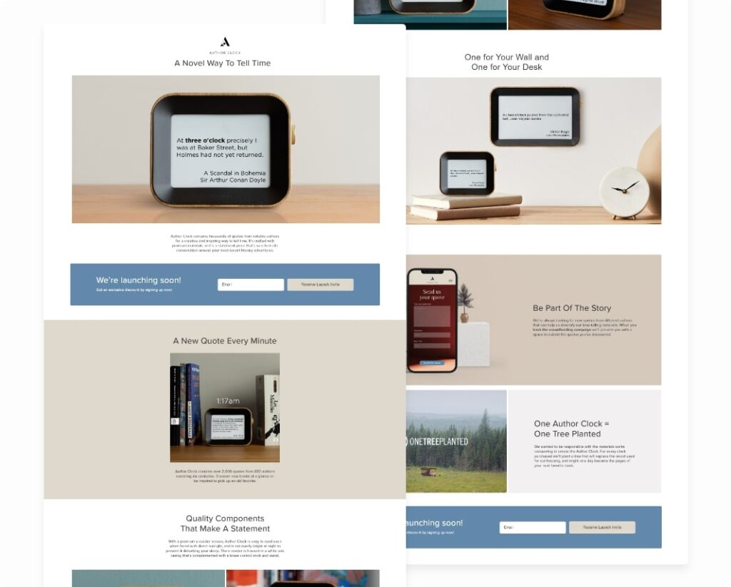
For Author Clock’s strategy, our intention was to include women in our marketing as much as we could. Generally, crowdfunding is a male-saturated market, but we recognized that this product had a very gender-neutral appeal.
Our designers intentionally chose fonts that had a gender-neutral feel and colors like light browns and blues that appealed to both a male and female palet.
For imagery, we wanted to feature the clock in spaces that readers would be familiar with, such as on desks and bookshelves. All of these decisions turned into a strategy that allowed Author Clock to achieve strong reservation rates throughout the pre-campaign testing phase.
Bonus Strategy Tip: When it comes to images with hands, we’ve found that it’s almost always best to use male hands to reduce the risk of alienating them. Product shots that feature female hands might suggest that a product is strictly feminine. However, data suggests that women are not turned off in the same way by product shots featuring male hands.
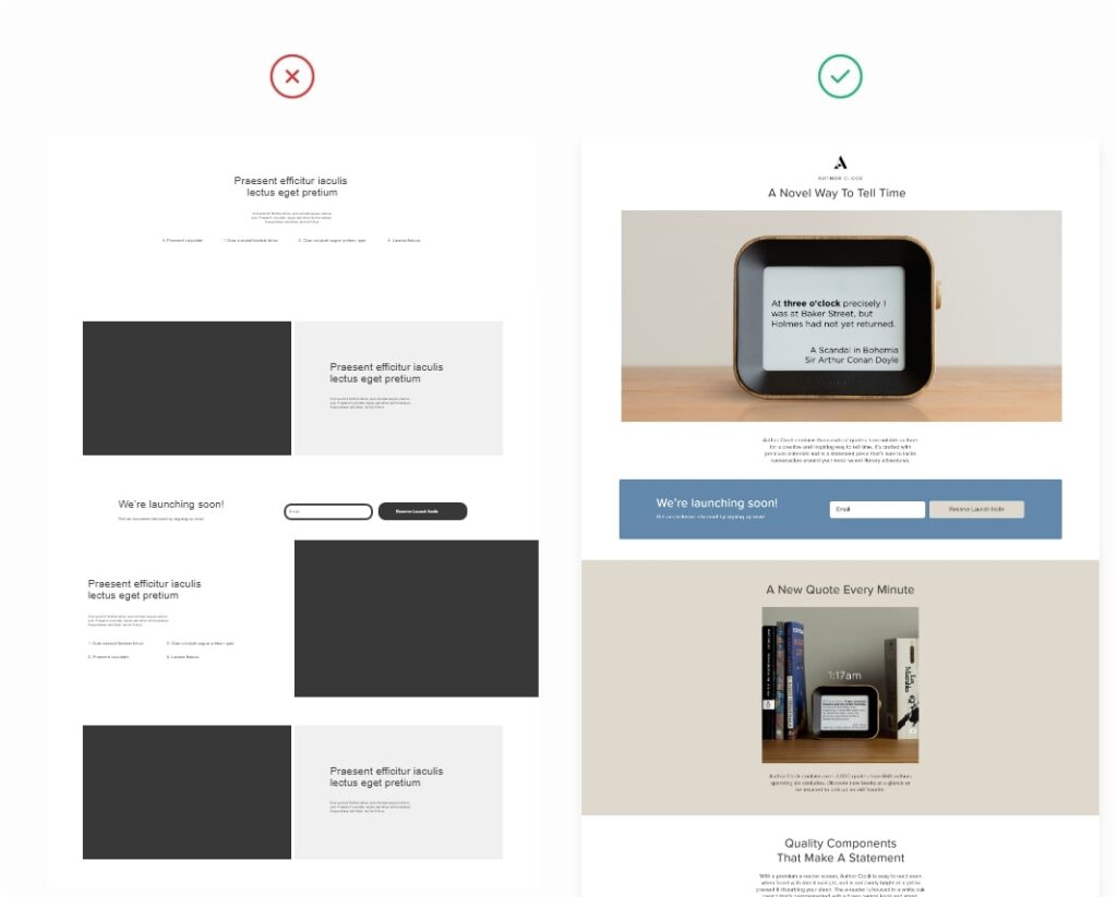
Tip #3: Design. Don’t decorate!
When you design a landing page, you need to make sure that you’re not just decorating. What do I mean by that?
Here’s how we define the difference: design contributes value and works in favor of the goal while decoration is simply filler. You might be questioning whether you’ll be able to tell the difference. Well, it’s actually simpler than you think.
As you’re revising your page ask yourself, “if I remove this element, would the design still be as effective?” If the answer is yes, then it’s decoration. If the answer is no, then it’s a crucial part of your design.
When you’re designing, you’re going to have to make a lot of decisions both big and small. Just remember that every decision you make should serve your original goal of the landing page.
For example, you’ll notice in the screenshots of our Author Clock landing page that the design is relatively simple. Nothing jumps off the page except for the product, and none of the sections are overdone. That was intentional.
It’s always better to pare down pages and get rid of fluff so that you can focus on correcting design based on user experience. One pain point with Author Clock was that people doubted the clock’s ability to tell obscure times like 4:53 with literary quotes.
Instead of trying to double down on something else like prettier photography or more eye-popping visuals, we addressed the issue with a simple gif that cycled through with random times in its database. This kind of design mindset is how you can consistently achieve better metrics.
Tip #4: Mobile first
For every page you design, you’ll naturally design a version for desktop. But, more importantly, you’ll also be designing a version for mobile. Yes, desktop matters, but get used to this mantra: “mobile first.”
Funnels for crowdfunding lead generation usually start with a Facebook or Instagram ad. Viewers who see these ads are enticed into clicking on them to learn more about the product. That brings them right to your landing page.
On which kind of device do you think most people are viewing Facebook and Instagram ads? That’s right–mobile! These days, more than 90% of the traffic that we get to our landing pages comes from mobile devices.
Now that I’ve convinced you about the importance of designing for mobile, here’s a checklist we use to make sure our pages stay optimized:
- The Call to Action is clear
- Type is big enough for easy readability
- Type is dark enough for easy readability
- Images, GIFs, and videos are compressed so that they load faster
- No more than 2 fonts used
- Headlines are easily distinguishable
- If you want something clickable, make it obvious
- Balance spacing to reduce the amount of scroll
Tip #5: Keep it simple
One of the quickest ways to get stuck during landing page design is to constantly think of it as a whole. It’s important to always keep your original goal in mind, but the overall layout can easily overwhelm you.
An easy way to avoid this is to break it down by sections. In the LaunchBoom formula, each section has a headline, a few lines of copy, and an image.
When you finish one section, it’s on to the next one! This also gives you the chance to try out some design choices on a section-by-section basis. Once you’re happy with the results of one section, you can apply that design to the rest.
While design is fun, it comes with a lot of responsibility. We have to create something that is fundamentally easy for users to navigate. The last thing you want is for a viewer to bounce because the user experience was bad. It’s much easier to tweak messaging to improve conversion rates rather than having to redo intricate design elements.
Many people are tempted to push their websites to crazy limits in order to stand out. While we encourage innovation, remember to let your product be the example of that innovation. The more familiar and simple your design is, the more comfortable and effective your page will be.
Key Takeaways
I hope you found this advice helpful. There’s a lot that goes into designing a landing page for crowdfunding that converts, but in summary:
- Always start with defining your goal. This will be the roadmap for your entire design.
- Know your target audience before choosing fonts and colors. Don’t just pick based on personal preference.
- If something can be removed without negatively impacting the value of the page, you can remove it.
- More than 90% of landing page traffic comes from mobile, so optimize your page for them.
- Keep it simple!
Thank you for checking out our 5 tips for helping you create a landing page for your product. We’ve got a ton more great insights and an extremely talented crowdfunding team. If you’re interested in working with us to make sure your Kickstarter or Indiegogo campaign is the best it can be, schedule a meeting with us today!